

To know about the first 12 types of Tableau Charts, click here to go to Part 01!
Line Charts
Line Charts are highly suitable for displaying tendencies and shifts over time; hence a date Field is a prime requirement for this chart type. There are three types of Line Charts,
- Continuous Line Chart
- Discrete Line Chart, and
- Dual Line Chart.
Let’s take a look at each in the mentioned order.
13. Continuous Line Chart
Minimum Requirements:
- 1 date
- 0 or more dimensions
- 1 or more measures
For instance, if you want to show the sales margin of a particular product over time, such as over a year, or two years, or even a span of six months, the Continuous Line Chart will do the work!
You can present the sales margin of more than one product simultaneously by adding more lines that are differently coloured.

Also, adding Trend Lines, (the dotted line shown in the image), to the visualization helps you tell an expansive story quickly.
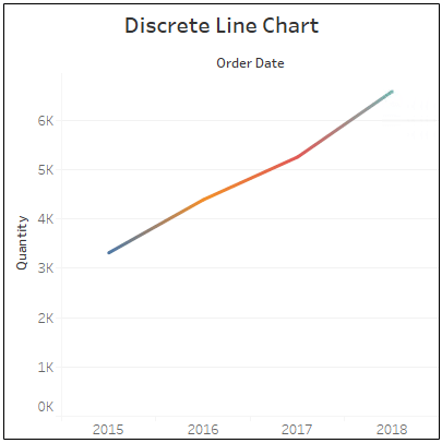
14. Discrete Line Chart
Minimum Requirements:
- 1 date
- 0 or more dimensions
- 1 or more measures
The difference between the Discrete Line Chart and Continuous Line Chart depends on the type of data fields that are associated with each. The two types of data fields are Discrete and Continuous fields, mapped accordingly to the former and latter chart types.
Continuous fields contain an infinite number of values, while Discrete fields contain finite values.
The Discrete values fall between a range, such as the number of customers in a particular area. Tableau helps you in identifying the fields as Discrete and Continuous, thus saving you the complexity.
The DL Chart enables you to break down the graph for a deeper analysis, to illustrate, take a look at the before-mentioned CL Chart. The graph flows continuously across the selected range of years, while in the DL chart, the graph is sliced in the middle, specifically after four months of each year. The slits in the graph allow you to instantly take a closer look at the sales margin for every four months.
The DL chart works best for analyzing micro-behaviors of large scale data without difficulty.
15. Dual Line Chart
Minimum Requirements:
- 1 date
- 0 or more dimensions
- 2 measures
The Dual Line Chart, also known as the Dual Axis Chart, allows you to present two Measures with two different axes. The Measures are assigned to two axes on either side of the horizontal axis, thereby making it easier to compare two Measures over the same time period.
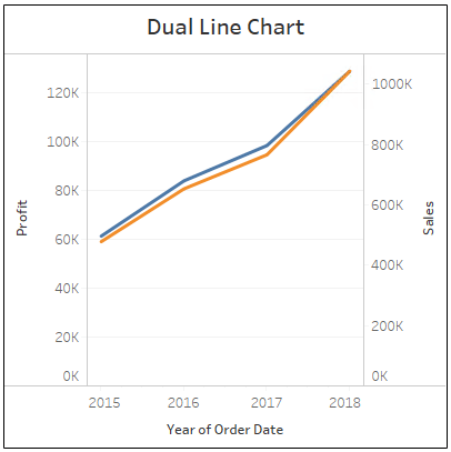
Do note that the two Measures that you select for comparison should be relevant to each other with a purposeful relationship, for example, Profit and Cost.
Make sure that your selection implies a message to the story that you plan on explaining.
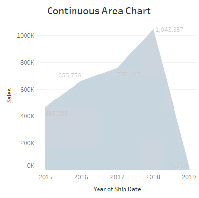
16. Continuous Area Chart
Minimum Requirements:
- 1 date
- 0 or more dimensions
- 1 or more measures
The Area Chart, in general, has the characteristics of both the Line Chart and the Stacked Bar Chart. It helps you to distinctly display the relative proportions of totals or the percentage relationships between Dimensions.
In the event of more than one Dimension, the Area Chart stacks the volume, in colour, beneath the Line. As a result, the total of the fields and also, their comparative size of Measures will be displayed accordingly.
Being a combination of the Line Charts, the Area Chart must contain a date field to create a view over time. In the Continuous Area Chart, the dates are continual.
17. Discrete Area Chart
Minimum Requirements:
- 1 date
- 0 or more dimensions
- 1 or more measures
The Discrete Area Chart is quite similar to the Continuous Area Chart; the only difference is that the former deals with discrete values.
Like the Discrete Line Chart, the Discrete Area Chart allows you to break down the graph as per your requirement.
You can slice a Continuous Area Chart by your desired time periods to take a magnifying look at the involute differences and details.
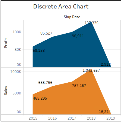
Area Charts are particularly beneficial for showing visualizations of comparison, such as between product categories, team performances, customer segments, and suchlike. With Area Charts, you can showcase the bigger picture along with the relative magnitude of individual factors.
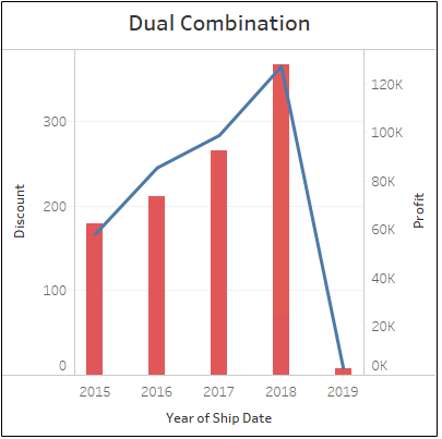
18. Dual Combination
Minimum Requirements:
- 1 date
- 0 or more dimensions
- 2 measures
The Dual Combination Chart has the layout of a Dual Line Chart, one common axis, the X-axis for the date, and two separate axes, the Y-axes for two different Measures. However, it uses multiple Mark Types for the Measures in the same sheet, hence the word, combination.
A common variant of the Dual Combination Chart is the Line-and-Bar, provided by Tableau.
In the Line-and-Bar Combination type, the first step is similar to creating a complete Dual Line Chart. Once the Second Measure gets dropped into the View, a new Marks shelf will get generated.
Now, the Mark for each Measure can be changed independently of each other, resultantly allowing you to create a View containing a combination of Mark Types.
19. Scatter Plot
Minimum Requirements:
- 0 or more dimensions
- 2-4 measures
The Scatter Plot, also known as the Scatter Diagram, or Scatter Chart, or Scatter Graph, is useful to compare two different Measures and to identify patterns.
The Scatter Plot, similar to the Circle View and Side-by-Side Circle View, uses symbols for visualization, which you can change according to your preference.
The distinctive feature of the Scatter Plot is that both the horizontal and vertical axes signify Measures, rather than Dimension. The data points are placed in the graph as specified by the numerical values of both the Measure.
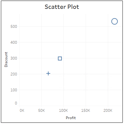
The shape formed by the data points reveals the heart of the story, the correlation present in the entire data. You can drop in Dimensions to add further details to the graph. Also, you can insert Trend Lines to outline the patterns indicating the correlations found in your data.
Scatter Plots show the underlying patterns and relationships existing in a large pool of data, offering an advantage that is unique from the others.
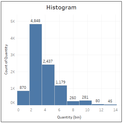
20. Histogram
Minimum Requirements:
- 1 measure (bin field)
The Histogram, in general, is defined as a graphical representation of the distribution of numerical data.
It is quite similar to the Bar Chart, but the Histogram arranges the values of a Continuous Measure into ranges.
In Tableau, the Histogram creates an additional bin field of your selected Measure, dividing the Measure into discrete intervals, collectively known as Bins.
The Bins help you get a quick analysis of the range of data distribution, also allowing you to add Dimensions to further breakdown the scrutiny.
Such insights will offer you the intricate intelligence needed to improve your business.
21. Box-and-Whisker Plot
Minimum Requirements:
- 0 or more dimensions
- 1 or more measures
The Box-and-Whisker Plot, also known as the Box Plot, is used to display the distribution of numerical values along an axis. (Take a look at the image)
Note: In statistical terms, a quartile is a kind of a quantile that divides a data range into four more or less equal quarters.
The Boxes indicate the middle two quartiles of the data’s distribution,i.e., the central 50 percent of the data. The lines jutting out from the top and bottom ends of the box are called the Whiskers. The Whiskers denote the interval between the minimum value of the first quartile and the maximum value of the fourth quartile.
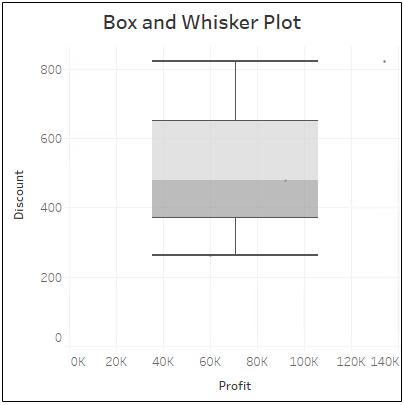
The composition of the graph begins with the user determining the median of the entire data set. The proceedings are as follows,
- The vertical intersection in the middle of the Box is the median of the selected data set,the part where there is a color transition from grey to light grey.
- The upper and lower quartiles of the Box denote the medians of the upper half and lower half of the data.
- The upper half of the Whiskers indicates the maximum of the data set, while the lower half denotes the minimum of the data set.
The Box-and-Whisker Plot works well for descriptive analysis as it presents the shape of the distribution, its central value, and its variability at one glance.
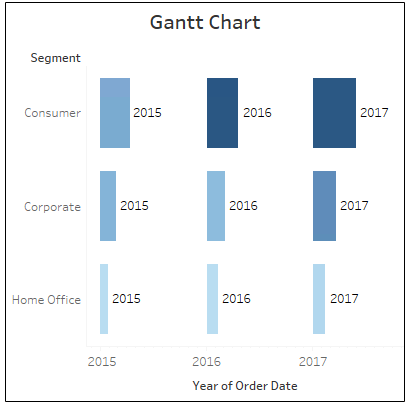
22. Gantt Chart
Minimum Requirements:
- 1 date
- 1 or more dimensions
- 0-2 measures
The Gantt Chart is a great way to depict information relating to time, offering a clear representation of its advancement and the corresponding tasks.
So, it stands as a compelling chart type to explain any progression in time, quite useful when it comes to picturing the various scheduling methods in a Project.
You can take each data point as a task and can plan its correlation and dependencies with other data points and resources. In this way, you get to image the flow of the Project and easily detect potential delays and disruptions.
23. Bullet Graph
Minimum Requirements:
- 0 or more dimensions
- 2 measures
You can use the Bullet Graph to compare your present data with the past data or a fixed margin. It is similar to a standard Bar Graph, the difference is, the distribution will be progressing towards a goal behind the Bar in the Bullet Graph.
In general words, the Bullet Graph is used to compare the actual data with a target or previous data, indicated by a reference line. For example, you can compare the present sales figures against the previous year’s sales or the assigned sales target. You can compare the actual cost against the budgeted cost and suchlike.
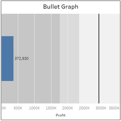
You can customize the size and colours to make your story more appealing. The Graph can also be presented either horizontally or vertically as per your convenience.
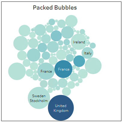
24. Packed Bubbles
Minimum Requirements:
- 1 or more dimensions
- 1 or 2 measures
The Packed Bubbles, also known as the Bubble Chart, exhibits relational value in clumps of circles without the use of axes. The individual bubbles denote the Dimensions, and the Measures define the size and colour of the Bubble, that is, the circle.
The bubbles are packed close to each other to save space for additional Dimensions. For instance, while showing the profit and sales percentage of a product, you can easily add different product categories to maximize the analysis.
The Packed Bubbles is a flexible option to display many values concerning one another, for study in a single View. A very colourful View, one can say!
TO CLOSE MORE DEALS FASTER
Just click here to learn Tableau quickly at QR solutions. we provide exceptional support to people who love to learn Tableau.
