The Side-by-Side Circle View allows you to add more Measures for displaying a side-by-side comparison, offering an intenser analysis. The Side-by-Side Circle View is a variation of the Circle View, as an extended version.
You can customize the Mark Type to suit the categories set in for comparison, to dilute data overload. This View is a quick way to add additional details within a broader message, enabling you to express your story clearly and concisely!
SCHEDULE MY CUSTOM CONSULTATION
Just click here to learn Tableau quickly at QR solutions. we provide exceptional support to people who love to learn Tableau.
The Circle View works best for comparative analysis, allowing you to customize the features of the Chart according to your preference.
As the name suggests, the default shape of the Mark is a circle, which you can change to your choice. The color and size of the Mark are decided based on the Keys you determine for the data sets.
For example, the color can point to the Region while the size indicates the Profit, hence the higher the Profit, the bigger the circle!
The Circle View is a persuasive chart type, as it allows you to compare numerous categories simultaneously.
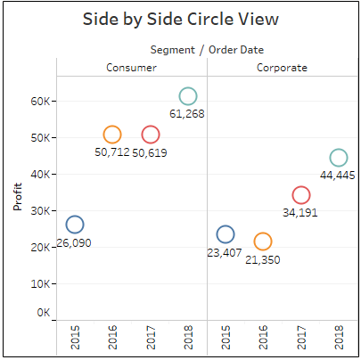
12. Side-by-Side Circle View
Minimum Requirements:
1 or more dimensions
1 or more measures (at least 3 fields)
The Side-by-Side Circle View allows you to add more Measures for displaying a side-by-side comparison, offering an intenser analysis. The Side-by-Side Circle View is a variation of the Circle View, as an extended version.
You can customize the Mark Type to suit the categories set in for comparison, to dilute data overload. This View is a quick way to add additional details within a broader message, enabling you to express your story clearly and concisely!
SCHEDULE MY CUSTOM CONSULTATION
Just click here to learn Tableau quickly at QR solutions. we provide exceptional support to people who love to learn Tableau.
The Circle View works best for comparative analysis, allowing you to customize the features of the Chart according to your preference.
As the name suggests, the default shape of the Mark is a circle, which you can change to your choice. The color and size of the Mark are decided based on the Keys you determine for the data sets.
For example, the color can point to the Region while the size indicates the Profit, hence the higher the Profit, the bigger the circle!
The Circle View is a persuasive chart type, as it allows you to compare numerous categories simultaneously.
12. Side-by-Side Circle View
Minimum Requirements:
1 or more dimensions
1 or more measures (at least 3 fields)
The Side-by-Side Circle View allows you to add more Measures for displaying a side-by-side comparison, offering an intenser analysis. The Side-by-Side Circle View is a variation of the Circle View, as an extended version.
You can customize the Mark Type to suit the categories set in for comparison, to dilute data overload. This View is a quick way to add additional details within a broader message, enabling you to express your story clearly and concisely!
SCHEDULE MY CUSTOM CONSULTATION
Just click here to learn Tableau quickly at QR solutions. we provide exceptional support to people who love to learn Tableau.
The Treemap is quite similar to a heat map, in terms of color-scheme and scalability. However, in Treemaps, the Nodes are grouped by their proximity in the hierarchy.
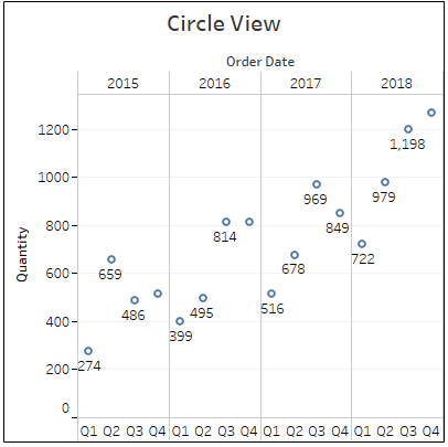
11. Circle View
Minimum Requirements:
1 or more dimensions
1 or more measures
The Circle View works best for comparative analysis, allowing you to customize the features of the Chart according to your preference.
As the name suggests, the default shape of the Mark is a circle, which you can change to your choice. The color and size of the Mark are decided based on the Keys you determine for the data sets.
For example, the color can point to the Region while the size indicates the Profit, hence the higher the Profit, the bigger the circle!
The Circle View is a persuasive chart type, as it allows you to compare numerous categories simultaneously.
12. Side-by-Side Circle View
Minimum Requirements:
1 or more dimensions
1 or more measures (at least 3 fields)
The Side-by-Side Circle View allows you to add more Measures for displaying a side-by-side comparison, offering an intenser analysis. The Side-by-Side Circle View is a variation of the Circle View, as an extended version.
You can customize the Mark Type to suit the categories set in for comparison, to dilute data overload. This View is a quick way to add additional details within a broader message, enabling you to express your story clearly and concisely!
SCHEDULE MY CUSTOM CONSULTATION
Just click here to learn Tableau quickly at QR solutions. we provide exceptional support to people who love to learn Tableau.
The Treemap is quite similar to a heat map, in terms of color-scheme and scalability. However, in Treemaps, the Nodes are grouped by their proximity in the hierarchy.
11. Circle View
Minimum Requirements:
1 or more dimensions
1 or more measures
The Circle View works best for comparative analysis, allowing you to customize the features of the Chart according to your preference.
As the name suggests, the default shape of the Mark is a circle, which you can change to your choice. The color and size of the Mark are decided based on the Keys you determine for the data sets.
For example, the color can point to the Region while the size indicates the Profit, hence the higher the Profit, the bigger the circle!
The Circle View is a persuasive chart type, as it allows you to compare numerous categories simultaneously.
12. Side-by-Side Circle View
Minimum Requirements:
1 or more dimensions
1 or more measures (at least 3 fields)
The Side-by-Side Circle View allows you to add more Measures for displaying a side-by-side comparison, offering an intenser analysis. The Side-by-Side Circle View is a variation of the Circle View, as an extended version.
You can customize the Mark Type to suit the categories set in for comparison, to dilute data overload. This View is a quick way to add additional details within a broader message, enabling you to express your story clearly and concisely!
SCHEDULE MY CUSTOM CONSULTATION
Just click here to learn Tableau quickly at QR solutions. we provide exceptional support to people who love to learn Tableau.
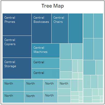
Treemaps are the star players of the Tableau Charts, used for illustrating hierarchical data in a tree-structured layout, and part-to-whole relationships.
Their inclusive visual nature makes Treemapping the ultimate choice to display numerous, even thousands of items, in a single View at once. As you mouse over the Nodes in the View, you will be able to see a tooltip appear that displays the specifics of each Node.
The Treemap is quite similar to a heat map, in terms of color-scheme and scalability. However, in Treemaps, the Nodes are grouped by their proximity in the hierarchy.
11. Circle View
Minimum Requirements:
1 or more dimensions
1 or more measures
The Circle View works best for comparative analysis, allowing you to customize the features of the Chart according to your preference.
As the name suggests, the default shape of the Mark is a circle, which you can change to your choice. The color and size of the Mark are decided based on the Keys you determine for the data sets.
For example, the color can point to the Region while the size indicates the Profit, hence the higher the Profit, the bigger the circle!
The Circle View is a persuasive chart type, as it allows you to compare numerous categories simultaneously.
12. Side-by-Side Circle View
Minimum Requirements:
1 or more dimensions
1 or more measures (at least 3 fields)
The Side-by-Side Circle View allows you to add more Measures for displaying a side-by-side comparison, offering an intenser analysis. The Side-by-Side Circle View is a variation of the Circle View, as an extended version.
You can customize the Mark Type to suit the categories set in for comparison, to dilute data overload. This View is a quick way to add additional details within a broader message, enabling you to express your story clearly and concisely!
SCHEDULE MY CUSTOM CONSULTATION
Just click here to learn Tableau quickly at QR solutions. we provide exceptional support to people who love to learn Tableau.
You can format this chart in different ways to highlight the various facets of your story; color-coding is the most commonly preferred among users.
10. Treemap
Minimum Requirements:
1 or more dimensions
1 or 2 measures
Treemaps are the star players of the Tableau Charts, used for illustrating hierarchical data in a tree-structured layout, and part-to-whole relationships.
Their inclusive visual nature makes Treemapping the ultimate choice to display numerous, even thousands of items, in a single View at once. As you mouse over the Nodes in the View, you will be able to see a tooltip appear that displays the specifics of each Node.
The Treemap is quite similar to a heat map, in terms of color-scheme and scalability. However, in Treemaps, the Nodes are grouped by their proximity in the hierarchy.
11. Circle View
Minimum Requirements:
1 or more dimensions
1 or more measures
The Circle View works best for comparative analysis, allowing you to customize the features of the Chart according to your preference.
As the name suggests, the default shape of the Mark is a circle, which you can change to your choice. The color and size of the Mark are decided based on the Keys you determine for the data sets.
For example, the color can point to the Region while the size indicates the Profit, hence the higher the Profit, the bigger the circle!
The Circle View is a persuasive chart type, as it allows you to compare numerous categories simultaneously.
12. Side-by-Side Circle View
Minimum Requirements:
1 or more dimensions
1 or more measures (at least 3 fields)
The Side-by-Side Circle View allows you to add more Measures for displaying a side-by-side comparison, offering an intenser analysis. The Side-by-Side Circle View is a variation of the Circle View, as an extended version.
You can customize the Mark Type to suit the categories set in for comparison, to dilute data overload. This View is a quick way to add additional details within a broader message, enabling you to express your story clearly and concisely!
SCHEDULE MY CUSTOM CONSULTATION
Just click here to learn Tableau quickly at QR solutions. we provide exceptional support to people who love to learn Tableau.
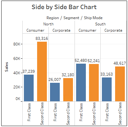
The side-by-side bar chart is quite similar to the stacked bar chart, with just one difference. Instead of stacking up the bar segments vertically, they are placed next to each other along the horizontal axis.
You can use this chart type to show a comparison between two or more dimensions or characteristics side by side. For example, comparing the sales volume of a product by regional areas, or comparing the sales volume of a product line at one particular region and so on.
You can format this chart in different ways to highlight the various facets of your story; color-coding is the most commonly preferred among users.
10. Treemap
Minimum Requirements:
1 or more dimensions
1 or 2 measures
Treemaps are the star players of the Tableau Charts, used for illustrating hierarchical data in a tree-structured layout, and part-to-whole relationships.
Their inclusive visual nature makes Treemapping the ultimate choice to display numerous, even thousands of items, in a single View at once. As you mouse over the Nodes in the View, you will be able to see a tooltip appear that displays the specifics of each Node.
The Treemap is quite similar to a heat map, in terms of color-scheme and scalability. However, in Treemaps, the Nodes are grouped by their proximity in the hierarchy.
11. Circle View
Minimum Requirements:
1 or more dimensions
1 or more measures
The Circle View works best for comparative analysis, allowing you to customize the features of the Chart according to your preference.
As the name suggests, the default shape of the Mark is a circle, which you can change to your choice. The color and size of the Mark are decided based on the Keys you determine for the data sets.
For example, the color can point to the Region while the size indicates the Profit, hence the higher the Profit, the bigger the circle!
The Circle View is a persuasive chart type, as it allows you to compare numerous categories simultaneously.
12. Side-by-Side Circle View
Minimum Requirements:
1 or more dimensions
1 or more measures (at least 3 fields)
The Side-by-Side Circle View allows you to add more Measures for displaying a side-by-side comparison, offering an intenser analysis. The Side-by-Side Circle View is a variation of the Circle View, as an extended version.
You can customize the Mark Type to suit the categories set in for comparison, to dilute data overload. This View is a quick way to add additional details within a broader message, enabling you to express your story clearly and concisely!
SCHEDULE MY CUSTOM CONSULTATION
Just click here to learn Tableau quickly at QR solutions. we provide exceptional support to people who love to learn Tableau.
However, a stacked bar chart is not an ideal choice for comparing individual data points, such as sales by customer. It stands perfect for comparing wholesale data sets, such as overall sales by product, by demographics, and so forth.
9. Side-by-Side Bar Chart
Minimum Requirements:
1 or more dimensions
1 or more measures
The side-by-side bar chart is quite similar to the stacked bar chart, with just one difference. Instead of stacking up the bar segments vertically, they are placed next to each other along the horizontal axis.
You can use this chart type to show a comparison between two or more dimensions or characteristics side by side. For example, comparing the sales volume of a product by regional areas, or comparing the sales volume of a product line at one particular region and so on.
You can format this chart in different ways to highlight the various facets of your story; color-coding is the most commonly preferred among users.
10. Treemap
Minimum Requirements:
1 or more dimensions
1 or 2 measures
Treemaps are the star players of the Tableau Charts, used for illustrating hierarchical data in a tree-structured layout, and part-to-whole relationships.
Their inclusive visual nature makes Treemapping the ultimate choice to display numerous, even thousands of items, in a single View at once. As you mouse over the Nodes in the View, you will be able to see a tooltip appear that displays the specifics of each Node.
The Treemap is quite similar to a heat map, in terms of color-scheme and scalability. However, in Treemaps, the Nodes are grouped by their proximity in the hierarchy.
11. Circle View
Minimum Requirements:
1 or more dimensions
1 or more measures
The Circle View works best for comparative analysis, allowing you to customize the features of the Chart according to your preference.
As the name suggests, the default shape of the Mark is a circle, which you can change to your choice. The color and size of the Mark are decided based on the Keys you determine for the data sets.
For example, the color can point to the Region while the size indicates the Profit, hence the higher the Profit, the bigger the circle!
The Circle View is a persuasive chart type, as it allows you to compare numerous categories simultaneously.
12. Side-by-Side Circle View
Minimum Requirements:
1 or more dimensions
1 or more measures (at least 3 fields)
The Side-by-Side Circle View allows you to add more Measures for displaying a side-by-side comparison, offering an intenser analysis. The Side-by-Side Circle View is a variation of the Circle View, as an extended version.
You can customize the Mark Type to suit the categories set in for comparison, to dilute data overload. This View is a quick way to add additional details within a broader message, enabling you to express your story clearly and concisely!
SCHEDULE MY CUSTOM CONSULTATION
Just click here to learn Tableau quickly at QR solutions. we provide exceptional support to people who love to learn Tableau.
The stacked bar chart allows you to add additional levels of data sets inside of a horizontal bar measure.
You get to stack another dimension on the data measures of a horizontal bar chart, thereby dividing the entire Measure into corresponding sub-categories. The sub-categories on each bar are then color-coded to exhibit the variation between them.
However, a stacked bar chart is not an ideal choice for comparing individual data points, such as sales by customer. It stands perfect for comparing wholesale data sets, such as overall sales by product, by demographics, and so forth.
9. Side-by-Side Bar Chart
Minimum Requirements:
1 or more dimensions
1 or more measures
The side-by-side bar chart is quite similar to the stacked bar chart, with just one difference. Instead of stacking up the bar segments vertically, they are placed next to each other along the horizontal axis.
You can use this chart type to show a comparison between two or more dimensions or characteristics side by side. For example, comparing the sales volume of a product by regional areas, or comparing the sales volume of a product line at one particular region and so on.
You can format this chart in different ways to highlight the various facets of your story; color-coding is the most commonly preferred among users.
10. Treemap
Minimum Requirements:
1 or more dimensions
1 or 2 measures
Treemaps are the star players of the Tableau Charts, used for illustrating hierarchical data in a tree-structured layout, and part-to-whole relationships.
Their inclusive visual nature makes Treemapping the ultimate choice to display numerous, even thousands of items, in a single View at once. As you mouse over the Nodes in the View, you will be able to see a tooltip appear that displays the specifics of each Node.
The Treemap is quite similar to a heat map, in terms of color-scheme and scalability. However, in Treemaps, the Nodes are grouped by their proximity in the hierarchy.
11. Circle View
Minimum Requirements:
1 or more dimensions
1 or more measures
The Circle View works best for comparative analysis, allowing you to customize the features of the Chart according to your preference.
As the name suggests, the default shape of the Mark is a circle, which you can change to your choice. The color and size of the Mark are decided based on the Keys you determine for the data sets.
For example, the color can point to the Region while the size indicates the Profit, hence the higher the Profit, the bigger the circle!
The Circle View is a persuasive chart type, as it allows you to compare numerous categories simultaneously.
12. Side-by-Side Circle View
Minimum Requirements:
1 or more dimensions
1 or more measures (at least 3 fields)
The Side-by-Side Circle View allows you to add more Measures for displaying a side-by-side comparison, offering an intenser analysis. The Side-by-Side Circle View is a variation of the Circle View, as an extended version.
You can customize the Mark Type to suit the categories set in for comparison, to dilute data overload. This View is a quick way to add additional details within a broader message, enabling you to express your story clearly and concisely!
SCHEDULE MY CUSTOM CONSULTATION
Just click here to learn Tableau quickly at QR solutions. we provide exceptional support to people who love to learn Tableau.
Also, you can apply additional formatting such as by color scheme and borders, to make the View more explanatory.
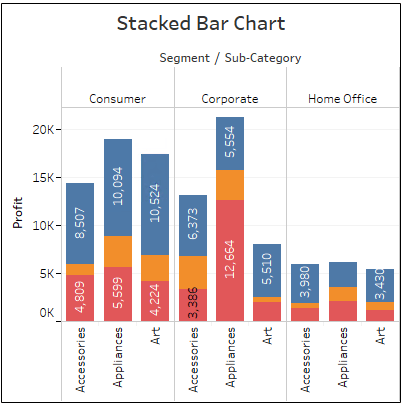
8. Stacked Bar Chart
Minimum Requirements:
1 or more dimensions
1 or more measures
The stacked bar chart allows you to add additional levels of data sets inside of a horizontal bar measure.
You get to stack another dimension on the data measures of a horizontal bar chart, thereby dividing the entire Measure into corresponding sub-categories. The sub-categories on each bar are then color-coded to exhibit the variation between them.
However, a stacked bar chart is not an ideal choice for comparing individual data points, such as sales by customer. It stands perfect for comparing wholesale data sets, such as overall sales by product, by demographics, and so forth.
9. Side-by-Side Bar Chart
Minimum Requirements:
1 or more dimensions
1 or more measures
The side-by-side bar chart is quite similar to the stacked bar chart, with just one difference. Instead of stacking up the bar segments vertically, they are placed next to each other along the horizontal axis.
You can use this chart type to show a comparison between two or more dimensions or characteristics side by side. For example, comparing the sales volume of a product by regional areas, or comparing the sales volume of a product line at one particular region and so on.
You can format this chart in different ways to highlight the various facets of your story; color-coding is the most commonly preferred among users.
10. Treemap
Minimum Requirements:
1 or more dimensions
1 or 2 measures
Treemaps are the star players of the Tableau Charts, used for illustrating hierarchical data in a tree-structured layout, and part-to-whole relationships.
Their inclusive visual nature makes Treemapping the ultimate choice to display numerous, even thousands of items, in a single View at once. As you mouse over the Nodes in the View, you will be able to see a tooltip appear that displays the specifics of each Node.
The Treemap is quite similar to a heat map, in terms of color-scheme and scalability. However, in Treemaps, the Nodes are grouped by their proximity in the hierarchy.
11. Circle View
Minimum Requirements:
1 or more dimensions
1 or more measures
The Circle View works best for comparative analysis, allowing you to customize the features of the Chart according to your preference.
As the name suggests, the default shape of the Mark is a circle, which you can change to your choice. The color and size of the Mark are decided based on the Keys you determine for the data sets.
For example, the color can point to the Region while the size indicates the Profit, hence the higher the Profit, the bigger the circle!
The Circle View is a persuasive chart type, as it allows you to compare numerous categories simultaneously.
12. Side-by-Side Circle View
Minimum Requirements:
1 or more dimensions
1 or more measures (at least 3 fields)
The Side-by-Side Circle View allows you to add more Measures for displaying a side-by-side comparison, offering an intenser analysis. The Side-by-Side Circle View is a variation of the Circle View, as an extended version.
You can customize the Mark Type to suit the categories set in for comparison, to dilute data overload. This View is a quick way to add additional details within a broader message, enabling you to express your story clearly and concisely!
SCHEDULE MY CUSTOM CONSULTATION
Just click here to learn Tableau quickly at QR solutions. we provide exceptional support to people who love to learn Tableau.
Also, you can apply additional formatting such as by color scheme and borders, to make the View more explanatory.
8. Stacked Bar Chart
Minimum Requirements:
1 or more dimensions
1 or more measures
The stacked bar chart allows you to add additional levels of data sets inside of a horizontal bar measure.
You get to stack another dimension on the data measures of a horizontal bar chart, thereby dividing the entire Measure into corresponding sub-categories. The sub-categories on each bar are then color-coded to exhibit the variation between them.
However, a stacked bar chart is not an ideal choice for comparing individual data points, such as sales by customer. It stands perfect for comparing wholesale data sets, such as overall sales by product, by demographics, and so forth.
9. Side-by-Side Bar Chart
Minimum Requirements:
1 or more dimensions
1 or more measures
The side-by-side bar chart is quite similar to the stacked bar chart, with just one difference. Instead of stacking up the bar segments vertically, they are placed next to each other along the horizontal axis.
You can use this chart type to show a comparison between two or more dimensions or characteristics side by side. For example, comparing the sales volume of a product by regional areas, or comparing the sales volume of a product line at one particular region and so on.
You can format this chart in different ways to highlight the various facets of your story; color-coding is the most commonly preferred among users.
10. Treemap
Minimum Requirements:
1 or more dimensions
1 or 2 measures
Treemaps are the star players of the Tableau Charts, used for illustrating hierarchical data in a tree-structured layout, and part-to-whole relationships.
Their inclusive visual nature makes Treemapping the ultimate choice to display numerous, even thousands of items, in a single View at once. As you mouse over the Nodes in the View, you will be able to see a tooltip appear that displays the specifics of each Node.
The Treemap is quite similar to a heat map, in terms of color-scheme and scalability. However, in Treemaps, the Nodes are grouped by their proximity in the hierarchy.
11. Circle View
Minimum Requirements:
1 or more dimensions
1 or more measures
The Circle View works best for comparative analysis, allowing you to customize the features of the Chart according to your preference.
As the name suggests, the default shape of the Mark is a circle, which you can change to your choice. The color and size of the Mark are decided based on the Keys you determine for the data sets.
For example, the color can point to the Region while the size indicates the Profit, hence the higher the Profit, the bigger the circle!
The Circle View is a persuasive chart type, as it allows you to compare numerous categories simultaneously.
12. Side-by-Side Circle View
Minimum Requirements:
1 or more dimensions
1 or more measures (at least 3 fields)
The Side-by-Side Circle View allows you to add more Measures for displaying a side-by-side comparison, offering an intenser analysis. The Side-by-Side Circle View is a variation of the Circle View, as an extended version.
You can customize the Mark Type to suit the categories set in for comparison, to dilute data overload. This View is a quick way to add additional details within a broader message, enabling you to express your story clearly and concisely!
SCHEDULE MY CUSTOM CONSULTATION
Just click here to learn Tableau quickly at QR solutions. we provide exceptional support to people who love to learn Tableau.
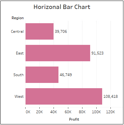
Another popular kid in the neighborhood is the Horizontal Bar Chart. Highly utilized and preferred by a majority of users, this chart type makes information consumption for the viewers quick and easy!
Horizontal Bar Charts display comparative data sets in a clear-cut way, thereby helping in a straightforward and simple analysis. The data sets can be sorted by value to present the highs and lows of a story.
Also, you can apply additional formatting such as by color scheme and borders, to make the View more explanatory.
8. Stacked Bar Chart
Minimum Requirements:
1 or more dimensions
1 or more measures
The stacked bar chart allows you to add additional levels of data sets inside of a horizontal bar measure.
You get to stack another dimension on the data measures of a horizontal bar chart, thereby dividing the entire Measure into corresponding sub-categories. The sub-categories on each bar are then color-coded to exhibit the variation between them.
However, a stacked bar chart is not an ideal choice for comparing individual data points, such as sales by customer. It stands perfect for comparing wholesale data sets, such as overall sales by product, by demographics, and so forth.
9. Side-by-Side Bar Chart
Minimum Requirements:
1 or more dimensions
1 or more measures
The side-by-side bar chart is quite similar to the stacked bar chart, with just one difference. Instead of stacking up the bar segments vertically, they are placed next to each other along the horizontal axis.
You can use this chart type to show a comparison between two or more dimensions or characteristics side by side. For example, comparing the sales volume of a product by regional areas, or comparing the sales volume of a product line at one particular region and so on.
You can format this chart in different ways to highlight the various facets of your story; color-coding is the most commonly preferred among users.
10. Treemap
Minimum Requirements:
1 or more dimensions
1 or 2 measures
Treemaps are the star players of the Tableau Charts, used for illustrating hierarchical data in a tree-structured layout, and part-to-whole relationships.
Their inclusive visual nature makes Treemapping the ultimate choice to display numerous, even thousands of items, in a single View at once. As you mouse over the Nodes in the View, you will be able to see a tooltip appear that displays the specifics of each Node.
The Treemap is quite similar to a heat map, in terms of color-scheme and scalability. However, in Treemaps, the Nodes are grouped by their proximity in the hierarchy.
11. Circle View
Minimum Requirements:
1 or more dimensions
1 or more measures
The Circle View works best for comparative analysis, allowing you to customize the features of the Chart according to your preference.
As the name suggests, the default shape of the Mark is a circle, which you can change to your choice. The color and size of the Mark are decided based on the Keys you determine for the data sets.
For example, the color can point to the Region while the size indicates the Profit, hence the higher the Profit, the bigger the circle!
The Circle View is a persuasive chart type, as it allows you to compare numerous categories simultaneously.
12. Side-by-Side Circle View
Minimum Requirements:
1 or more dimensions
1 or more measures (at least 3 fields)
The Side-by-Side Circle View allows you to add more Measures for displaying a side-by-side comparison, offering an intenser analysis. The Side-by-Side Circle View is a variation of the Circle View, as an extended version.
You can customize the Mark Type to suit the categories set in for comparison, to dilute data overload. This View is a quick way to add additional details within a broader message, enabling you to express your story clearly and concisely!
SCHEDULE MY CUSTOM CONSULTATION
Just click here to learn Tableau quickly at QR solutions. we provide exceptional support to people who love to learn Tableau.
When used with accuracy, pie charts can swiftly convey the relative value of the data points in the measure.
Note: While using pie-charts, it is advised to limit the number of wedges to six, as opting for a higher number of pie-pieces would make the interpretation and analysis difficult.
7. Horizontal Bar Chart
Minimum Requirements:
0 or more dimensions
1 or more measures
Another popular kid in the neighborhood is the Horizontal Bar Chart. Highly utilized and preferred by a majority of users, this chart type makes information consumption for the viewers quick and easy!
Horizontal Bar Charts display comparative data sets in a clear-cut way, thereby helping in a straightforward and simple analysis. The data sets can be sorted by value to present the highs and lows of a story.
Also, you can apply additional formatting such as by color scheme and borders, to make the View more explanatory.
8. Stacked Bar Chart
Minimum Requirements:
1 or more dimensions
1 or more measures
The stacked bar chart allows you to add additional levels of data sets inside of a horizontal bar measure.
You get to stack another dimension on the data measures of a horizontal bar chart, thereby dividing the entire Measure into corresponding sub-categories. The sub-categories on each bar are then color-coded to exhibit the variation between them.
However, a stacked bar chart is not an ideal choice for comparing individual data points, such as sales by customer. It stands perfect for comparing wholesale data sets, such as overall sales by product, by demographics, and so forth.
9. Side-by-Side Bar Chart
Minimum Requirements:
1 or more dimensions
1 or more measures
The side-by-side bar chart is quite similar to the stacked bar chart, with just one difference. Instead of stacking up the bar segments vertically, they are placed next to each other along the horizontal axis.
You can use this chart type to show a comparison between two or more dimensions or characteristics side by side. For example, comparing the sales volume of a product by regional areas, or comparing the sales volume of a product line at one particular region and so on.
You can format this chart in different ways to highlight the various facets of your story; color-coding is the most commonly preferred among users.
10. Treemap
Minimum Requirements:
1 or more dimensions
1 or 2 measures
Treemaps are the star players of the Tableau Charts, used for illustrating hierarchical data in a tree-structured layout, and part-to-whole relationships.
Their inclusive visual nature makes Treemapping the ultimate choice to display numerous, even thousands of items, in a single View at once. As you mouse over the Nodes in the View, you will be able to see a tooltip appear that displays the specifics of each Node.
The Treemap is quite similar to a heat map, in terms of color-scheme and scalability. However, in Treemaps, the Nodes are grouped by their proximity in the hierarchy.
11. Circle View
Minimum Requirements:
1 or more dimensions
1 or more measures
The Circle View works best for comparative analysis, allowing you to customize the features of the Chart according to your preference.
As the name suggests, the default shape of the Mark is a circle, which you can change to your choice. The color and size of the Mark are decided based on the Keys you determine for the data sets.
For example, the color can point to the Region while the size indicates the Profit, hence the higher the Profit, the bigger the circle!
The Circle View is a persuasive chart type, as it allows you to compare numerous categories simultaneously.
12. Side-by-Side Circle View
Minimum Requirements:
1 or more dimensions
1 or more measures (at least 3 fields)
The Side-by-Side Circle View allows you to add more Measures for displaying a side-by-side comparison, offering an intenser analysis. The Side-by-Side Circle View is a variation of the Circle View, as an extended version.
You can customize the Mark Type to suit the categories set in for comparison, to dilute data overload. This View is a quick way to add additional details within a broader message, enabling you to express your story clearly and concisely!
SCHEDULE MY CUSTOM CONSULTATION
Just click here to learn Tableau quickly at QR solutions. we provide exceptional support to people who love to learn Tableau.
For, a View of just the chart without the values can seem ambiguous, in the case of close range numbers.
When used with accuracy, pie charts can swiftly convey the relative value of the data points in the measure.
Note: While using pie-charts, it is advised to limit the number of wedges to six, as opting for a higher number of pie-pieces would make the interpretation and analysis difficult.
7. Horizontal Bar Chart
Minimum Requirements:
0 or more dimensions
1 or more measures
Another popular kid in the neighborhood is the Horizontal Bar Chart. Highly utilized and preferred by a majority of users, this chart type makes information consumption for the viewers quick and easy!
Horizontal Bar Charts display comparative data sets in a clear-cut way, thereby helping in a straightforward and simple analysis. The data sets can be sorted by value to present the highs and lows of a story.
Also, you can apply additional formatting such as by color scheme and borders, to make the View more explanatory.
8. Stacked Bar Chart
Minimum Requirements:
1 or more dimensions
1 or more measures
The stacked bar chart allows you to add additional levels of data sets inside of a horizontal bar measure.
You get to stack another dimension on the data measures of a horizontal bar chart, thereby dividing the entire Measure into corresponding sub-categories. The sub-categories on each bar are then color-coded to exhibit the variation between them.
However, a stacked bar chart is not an ideal choice for comparing individual data points, such as sales by customer. It stands perfect for comparing wholesale data sets, such as overall sales by product, by demographics, and so forth.
9. Side-by-Side Bar Chart
Minimum Requirements:
1 or more dimensions
1 or more measures
The side-by-side bar chart is quite similar to the stacked bar chart, with just one difference. Instead of stacking up the bar segments vertically, they are placed next to each other along the horizontal axis.
You can use this chart type to show a comparison between two or more dimensions or characteristics side by side. For example, comparing the sales volume of a product by regional areas, or comparing the sales volume of a product line at one particular region and so on.
You can format this chart in different ways to highlight the various facets of your story; color-coding is the most commonly preferred among users.
10. Treemap
Minimum Requirements:
1 or more dimensions
1 or 2 measures
Treemaps are the star players of the Tableau Charts, used for illustrating hierarchical data in a tree-structured layout, and part-to-whole relationships.
Their inclusive visual nature makes Treemapping the ultimate choice to display numerous, even thousands of items, in a single View at once. As you mouse over the Nodes in the View, you will be able to see a tooltip appear that displays the specifics of each Node.
The Treemap is quite similar to a heat map, in terms of color-scheme and scalability. However, in Treemaps, the Nodes are grouped by their proximity in the hierarchy.
11. Circle View
Minimum Requirements:
1 or more dimensions
1 or more measures
The Circle View works best for comparative analysis, allowing you to customize the features of the Chart according to your preference.
As the name suggests, the default shape of the Mark is a circle, which you can change to your choice. The color and size of the Mark are decided based on the Keys you determine for the data sets.
For example, the color can point to the Region while the size indicates the Profit, hence the higher the Profit, the bigger the circle!
The Circle View is a persuasive chart type, as it allows you to compare numerous categories simultaneously.
12. Side-by-Side Circle View
Minimum Requirements:
1 or more dimensions
1 or more measures (at least 3 fields)
The Side-by-Side Circle View allows you to add more Measures for displaying a side-by-side comparison, offering an intenser analysis. The Side-by-Side Circle View is a variation of the Circle View, as an extended version.
You can customize the Mark Type to suit the categories set in for comparison, to dilute data overload. This View is a quick way to add additional details within a broader message, enabling you to express your story clearly and concisely!
SCHEDULE MY CUSTOM CONSULTATION
Just click here to learn Tableau quickly at QR solutions. we provide exceptional support to people who love to learn Tableau.
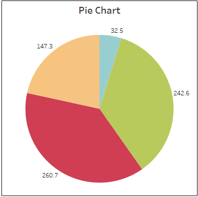
Whether it’s because of its perfection in shape, or the optical finesse it delivers, pie charts are everyone’s favorite! From classrooms to business presentations!
They are well-suited to displaying proportionate and percentage correlation between data. However, make sure to present the numeric value of the data along with the pie-chart.
For, a View of just the chart without the values can seem ambiguous, in the case of close range numbers.
When used with accuracy, pie charts can swiftly convey the relative value of the data points in the measure.
Note: While using pie-charts, it is advised to limit the number of wedges to six, as opting for a higher number of pie-pieces would make the interpretation and analysis difficult.
7. Horizontal Bar Chart
Minimum Requirements:
0 or more dimensions
1 or more measures
Another popular kid in the neighborhood is the Horizontal Bar Chart. Highly utilized and preferred by a majority of users, this chart type makes information consumption for the viewers quick and easy!
Horizontal Bar Charts display comparative data sets in a clear-cut way, thereby helping in a straightforward and simple analysis. The data sets can be sorted by value to present the highs and lows of a story.
Also, you can apply additional formatting such as by color scheme and borders, to make the View more explanatory.
8. Stacked Bar Chart
Minimum Requirements:
1 or more dimensions
1 or more measures
The stacked bar chart allows you to add additional levels of data sets inside of a horizontal bar measure.
You get to stack another dimension on the data measures of a horizontal bar chart, thereby dividing the entire Measure into corresponding sub-categories. The sub-categories on each bar are then color-coded to exhibit the variation between them.
However, a stacked bar chart is not an ideal choice for comparing individual data points, such as sales by customer. It stands perfect for comparing wholesale data sets, such as overall sales by product, by demographics, and so forth.
9. Side-by-Side Bar Chart
Minimum Requirements:
1 or more dimensions
1 or more measures
The side-by-side bar chart is quite similar to the stacked bar chart, with just one difference. Instead of stacking up the bar segments vertically, they are placed next to each other along the horizontal axis.
You can use this chart type to show a comparison between two or more dimensions or characteristics side by side. For example, comparing the sales volume of a product by regional areas, or comparing the sales volume of a product line at one particular region and so on.
You can format this chart in different ways to highlight the various facets of your story; color-coding is the most commonly preferred among users.
10. Treemap
Minimum Requirements:
1 or more dimensions
1 or 2 measures
Treemaps are the star players of the Tableau Charts, used for illustrating hierarchical data in a tree-structured layout, and part-to-whole relationships.
Their inclusive visual nature makes Treemapping the ultimate choice to display numerous, even thousands of items, in a single View at once. As you mouse over the Nodes in the View, you will be able to see a tooltip appear that displays the specifics of each Node.
The Treemap is quite similar to a heat map, in terms of color-scheme and scalability. However, in Treemaps, the Nodes are grouped by their proximity in the hierarchy.
11. Circle View
Minimum Requirements:
1 or more dimensions
1 or more measures
The Circle View works best for comparative analysis, allowing you to customize the features of the Chart according to your preference.
As the name suggests, the default shape of the Mark is a circle, which you can change to your choice. The color and size of the Mark are decided based on the Keys you determine for the data sets.
For example, the color can point to the Region while the size indicates the Profit, hence the higher the Profit, the bigger the circle!
The Circle View is a persuasive chart type, as it allows you to compare numerous categories simultaneously.
12. Side-by-Side Circle View
Minimum Requirements:
1 or more dimensions
1 or more measures (at least 3 fields)
The Side-by-Side Circle View allows you to add more Measures for displaying a side-by-side comparison, offering an intenser analysis. The Side-by-Side Circle View is a variation of the Circle View, as an extended version.
You can customize the Mark Type to suit the categories set in for comparison, to dilute data overload. This View is a quick way to add additional details within a broader message, enabling you to express your story clearly and concisely!
SCHEDULE MY CUSTOM CONSULTATION
Just click here to learn Tableau quickly at QR solutions. we provide exceptional support to people who love to learn Tableau.
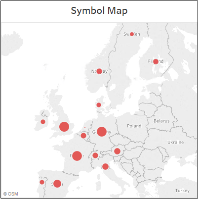
Note: You can also use maps as a filter while working with other types of charts, graphs, and tables. Club together a map with other applicable data, to use it as a filter for a large-scale analysis of your data!
6. Pie Chart
Minimum Requirements:
1 or more dimensions
1 or 2 measure
Whether it’s because of its perfection in shape, or the optical finesse it delivers, pie charts are everyone’s favorite! From classrooms to business presentations!
They are well-suited to displaying proportionate and percentage correlation between data. However, make sure to present the numeric value of the data along with the pie-chart.
For, a View of just the chart without the values can seem ambiguous, in the case of close range numbers.
When used with accuracy, pie charts can swiftly convey the relative value of the data points in the measure.
Note: While using pie-charts, it is advised to limit the number of wedges to six, as opting for a higher number of pie-pieces would make the interpretation and analysis difficult.
7. Horizontal Bar Chart
Minimum Requirements:
0 or more dimensions
1 or more measures
Another popular kid in the neighborhood is the Horizontal Bar Chart. Highly utilized and preferred by a majority of users, this chart type makes information consumption for the viewers quick and easy!
Horizontal Bar Charts display comparative data sets in a clear-cut way, thereby helping in a straightforward and simple analysis. The data sets can be sorted by value to present the highs and lows of a story.
Also, you can apply additional formatting such as by color scheme and borders, to make the View more explanatory.
8. Stacked Bar Chart
Minimum Requirements:
1 or more dimensions
1 or more measures
The stacked bar chart allows you to add additional levels of data sets inside of a horizontal bar measure.
You get to stack another dimension on the data measures of a horizontal bar chart, thereby dividing the entire Measure into corresponding sub-categories. The sub-categories on each bar are then color-coded to exhibit the variation between them.
However, a stacked bar chart is not an ideal choice for comparing individual data points, such as sales by customer. It stands perfect for comparing wholesale data sets, such as overall sales by product, by demographics, and so forth.
9. Side-by-Side Bar Chart
Minimum Requirements:
1 or more dimensions
1 or more measures
The side-by-side bar chart is quite similar to the stacked bar chart, with just one difference. Instead of stacking up the bar segments vertically, they are placed next to each other along the horizontal axis.
You can use this chart type to show a comparison between two or more dimensions or characteristics side by side. For example, comparing the sales volume of a product by regional areas, or comparing the sales volume of a product line at one particular region and so on.
You can format this chart in different ways to highlight the various facets of your story; color-coding is the most commonly preferred among users.
10. Treemap
Minimum Requirements:
1 or more dimensions
1 or 2 measures
Treemaps are the star players of the Tableau Charts, used for illustrating hierarchical data in a tree-structured layout, and part-to-whole relationships.
Their inclusive visual nature makes Treemapping the ultimate choice to display numerous, even thousands of items, in a single View at once. As you mouse over the Nodes in the View, you will be able to see a tooltip appear that displays the specifics of each Node.
The Treemap is quite similar to a heat map, in terms of color-scheme and scalability. However, in Treemaps, the Nodes are grouped by their proximity in the hierarchy.
11. Circle View
Minimum Requirements:
1 or more dimensions
1 or more measures
The Circle View works best for comparative analysis, allowing you to customize the features of the Chart according to your preference.
As the name suggests, the default shape of the Mark is a circle, which you can change to your choice. The color and size of the Mark are decided based on the Keys you determine for the data sets.
For example, the color can point to the Region while the size indicates the Profit, hence the higher the Profit, the bigger the circle!
The Circle View is a persuasive chart type, as it allows you to compare numerous categories simultaneously.
12. Side-by-Side Circle View
Minimum Requirements:
1 or more dimensions
1 or more measures (at least 3 fields)
The Side-by-Side Circle View allows you to add more Measures for displaying a side-by-side comparison, offering an intenser analysis. The Side-by-Side Circle View is a variation of the Circle View, as an extended version.
You can customize the Mark Type to suit the categories set in for comparison, to dilute data overload. This View is a quick way to add additional details within a broader message, enabling you to express your story clearly and concisely!
SCHEDULE MY CUSTOM CONSULTATION
Just click here to learn Tableau quickly at QR solutions. we provide exceptional support to people who love to learn Tableau.
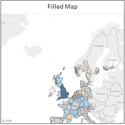
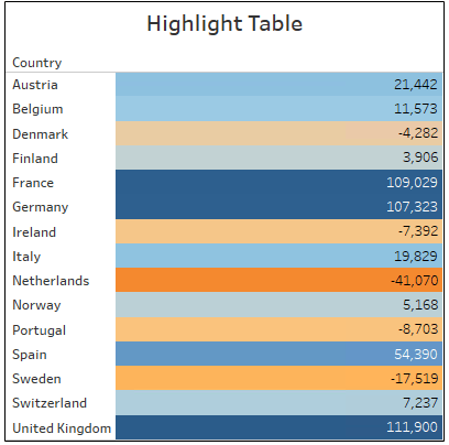
Filled Maps are quite similar to Symbol Maps; the only difference is that, instead of symbols, you get to fill the geographical region with colour to create a View. You can adjust the transparency and the width of borders to make the visuals more engaging.
Filled Maps offer a quick way to point out and name regions of your data, skipping all the tedious intricate work.
Note: You can also use maps as a filter while working with other types of charts, graphs, and tables. Club together a map with other applicable data, to use it as a filter for a large-scale analysis of your data!
6. Pie Chart
Minimum Requirements:
1 or more dimensions
1 or 2 measure
Whether it’s because of its perfection in shape, or the optical finesse it delivers, pie charts are everyone’s favorite! From classrooms to business presentations!
They are well-suited to displaying proportionate and percentage correlation between data. However, make sure to present the numeric value of the data along with the pie-chart.
For, a View of just the chart without the values can seem ambiguous, in the case of close range numbers.
When used with accuracy, pie charts can swiftly convey the relative value of the data points in the measure.
Note: While using pie-charts, it is advised to limit the number of wedges to six, as opting for a higher number of pie-pieces would make the interpretation and analysis difficult.
7. Horizontal Bar Chart
Minimum Requirements:
0 or more dimensions
1 or more measures
Another popular kid in the neighborhood is the Horizontal Bar Chart. Highly utilized and preferred by a majority of users, this chart type makes information consumption for the viewers quick and easy!
Horizontal Bar Charts display comparative data sets in a clear-cut way, thereby helping in a straightforward and simple analysis. The data sets can be sorted by value to present the highs and lows of a story.
Also, you can apply additional formatting such as by color scheme and borders, to make the View more explanatory.
8. Stacked Bar Chart
Minimum Requirements:
1 or more dimensions
1 or more measures
The stacked bar chart allows you to add additional levels of data sets inside of a horizontal bar measure.
You get to stack another dimension on the data measures of a horizontal bar chart, thereby dividing the entire Measure into corresponding sub-categories. The sub-categories on each bar are then color-coded to exhibit the variation between them.
However, a stacked bar chart is not an ideal choice for comparing individual data points, such as sales by customer. It stands perfect for comparing wholesale data sets, such as overall sales by product, by demographics, and so forth.
9. Side-by-Side Bar Chart
Minimum Requirements:
1 or more dimensions
1 or more measures
The side-by-side bar chart is quite similar to the stacked bar chart, with just one difference. Instead of stacking up the bar segments vertically, they are placed next to each other along the horizontal axis.
You can use this chart type to show a comparison between two or more dimensions or characteristics side by side. For example, comparing the sales volume of a product by regional areas, or comparing the sales volume of a product line at one particular region and so on.
You can format this chart in different ways to highlight the various facets of your story; color-coding is the most commonly preferred among users.
10. Treemap
Minimum Requirements:
1 or more dimensions
1 or 2 measures
Treemaps are the star players of the Tableau Charts, used for illustrating hierarchical data in a tree-structured layout, and part-to-whole relationships.
Their inclusive visual nature makes Treemapping the ultimate choice to display numerous, even thousands of items, in a single View at once. As you mouse over the Nodes in the View, you will be able to see a tooltip appear that displays the specifics of each Node.
The Treemap is quite similar to a heat map, in terms of color-scheme and scalability. However, in Treemaps, the Nodes are grouped by their proximity in the hierarchy.
11. Circle View
Minimum Requirements:
1 or more dimensions
1 or more measures
The Circle View works best for comparative analysis, allowing you to customize the features of the Chart according to your preference.
As the name suggests, the default shape of the Mark is a circle, which you can change to your choice. The color and size of the Mark are decided based on the Keys you determine for the data sets.
For example, the color can point to the Region while the size indicates the Profit, hence the higher the Profit, the bigger the circle!
The Circle View is a persuasive chart type, as it allows you to compare numerous categories simultaneously.
12. Side-by-Side Circle View
Minimum Requirements:
1 or more dimensions
1 or more measures (at least 3 fields)
The Side-by-Side Circle View allows you to add more Measures for displaying a side-by-side comparison, offering an intenser analysis. The Side-by-Side Circle View is a variation of the Circle View, as an extended version.
You can customize the Mark Type to suit the categories set in for comparison, to dilute data overload. This View is a quick way to add additional details within a broader message, enabling you to express your story clearly and concisely!
SCHEDULE MY CUSTOM CONSULTATION
Just click here to learn Tableau quickly at QR solutions. we provide exceptional support to people who love to learn Tableau.
Symbol Maps, like the name indicates, are maps that use symbols to represent your data. In addition to the default symbols, you can create custom shapes and even change the Marks to different shapes and colours.
Symbol Maps help highlight broad areas of interest and in identifying the concentration of data points in a particular region, such as sales, customers, and suchlike.
5. Filled Map
Minimum Requirements:
1 geo dimension
0 or more dimensions
0 to 2 measures
Filled Maps are quite similar to Symbol Maps; the only difference is that, instead of symbols, you get to fill the geographical region with colour to create a View. You can adjust the transparency and the width of borders to make the visuals more engaging.
Filled Maps offer a quick way to point out and name regions of your data, skipping all the tedious intricate work.
Note: You can also use maps as a filter while working with other types of charts, graphs, and tables. Club together a map with other applicable data, to use it as a filter for a large-scale analysis of your data!
6. Pie Chart
Minimum Requirements:
1 or more dimensions
1 or 2 measure
Whether it’s because of its perfection in shape, or the optical finesse it delivers, pie charts are everyone’s favorite! From classrooms to business presentations!
They are well-suited to displaying proportionate and percentage correlation between data. However, make sure to present the numeric value of the data along with the pie-chart.
For, a View of just the chart without the values can seem ambiguous, in the case of close range numbers.
When used with accuracy, pie charts can swiftly convey the relative value of the data points in the measure.
Note: While using pie-charts, it is advised to limit the number of wedges to six, as opting for a higher number of pie-pieces would make the interpretation and analysis difficult.
7. Horizontal Bar Chart
Minimum Requirements:
0 or more dimensions
1 or more measures
Another popular kid in the neighborhood is the Horizontal Bar Chart. Highly utilized and preferred by a majority of users, this chart type makes information consumption for the viewers quick and easy!
Horizontal Bar Charts display comparative data sets in a clear-cut way, thereby helping in a straightforward and simple analysis. The data sets can be sorted by value to present the highs and lows of a story.
Also, you can apply additional formatting such as by color scheme and borders, to make the View more explanatory.
8. Stacked Bar Chart
Minimum Requirements:
1 or more dimensions
1 or more measures
The stacked bar chart allows you to add additional levels of data sets inside of a horizontal bar measure.
You get to stack another dimension on the data measures of a horizontal bar chart, thereby dividing the entire Measure into corresponding sub-categories. The sub-categories on each bar are then color-coded to exhibit the variation between them.
However, a stacked bar chart is not an ideal choice for comparing individual data points, such as sales by customer. It stands perfect for comparing wholesale data sets, such as overall sales by product, by demographics, and so forth.
9. Side-by-Side Bar Chart
Minimum Requirements:
1 or more dimensions
1 or more measures
The side-by-side bar chart is quite similar to the stacked bar chart, with just one difference. Instead of stacking up the bar segments vertically, they are placed next to each other along the horizontal axis.
You can use this chart type to show a comparison between two or more dimensions or characteristics side by side. For example, comparing the sales volume of a product by regional areas, or comparing the sales volume of a product line at one particular region and so on.
You can format this chart in different ways to highlight the various facets of your story; color-coding is the most commonly preferred among users.
10. Treemap
Minimum Requirements:
1 or more dimensions
1 or 2 measures
Treemaps are the star players of the Tableau Charts, used for illustrating hierarchical data in a tree-structured layout, and part-to-whole relationships.
Their inclusive visual nature makes Treemapping the ultimate choice to display numerous, even thousands of items, in a single View at once. As you mouse over the Nodes in the View, you will be able to see a tooltip appear that displays the specifics of each Node.
The Treemap is quite similar to a heat map, in terms of color-scheme and scalability. However, in Treemaps, the Nodes are grouped by their proximity in the hierarchy.
11. Circle View
Minimum Requirements:
1 or more dimensions
1 or more measures
The Circle View works best for comparative analysis, allowing you to customize the features of the Chart according to your preference.
As the name suggests, the default shape of the Mark is a circle, which you can change to your choice. The color and size of the Mark are decided based on the Keys you determine for the data sets.
For example, the color can point to the Region while the size indicates the Profit, hence the higher the Profit, the bigger the circle!
The Circle View is a persuasive chart type, as it allows you to compare numerous categories simultaneously.
12. Side-by-Side Circle View
Minimum Requirements:
1 or more dimensions
1 or more measures (at least 3 fields)
The Side-by-Side Circle View allows you to add more Measures for displaying a side-by-side comparison, offering an intenser analysis. The Side-by-Side Circle View is a variation of the Circle View, as an extended version.
You can customize the Mark Type to suit the categories set in for comparison, to dilute data overload. This View is a quick way to add additional details within a broader message, enabling you to express your story clearly and concisely!
SCHEDULE MY CUSTOM CONSULTATION
Just click here to learn Tableau quickly at QR solutions. we provide exceptional support to people who love to learn Tableau.
There are exclusively two chart types to choose from when it comes to geographic data; Symbol Maps and Filled Maps.
4. Symbol Map
Minimum Requirements:
1 geo dimension
0 or more dimensions
0 to 2 measures
Symbol Maps, like the name indicates, are maps that use symbols to represent your data. In addition to the default symbols, you can create custom shapes and even change the Marks to different shapes and colours.
Symbol Maps help highlight broad areas of interest and in identifying the concentration of data points in a particular region, such as sales, customers, and suchlike.
5. Filled Map
Minimum Requirements:
1 geo dimension
0 or more dimensions
0 to 2 measures
Filled Maps are quite similar to Symbol Maps; the only difference is that, instead of symbols, you get to fill the geographical region with colour to create a View. You can adjust the transparency and the width of borders to make the visuals more engaging.
Filled Maps offer a quick way to point out and name regions of your data, skipping all the tedious intricate work.
Note: You can also use maps as a filter while working with other types of charts, graphs, and tables. Club together a map with other applicable data, to use it as a filter for a large-scale analysis of your data!
6. Pie Chart
Minimum Requirements:
1 or more dimensions
1 or 2 measure
Whether it’s because of its perfection in shape, or the optical finesse it delivers, pie charts are everyone’s favorite! From classrooms to business presentations!
They are well-suited to displaying proportionate and percentage correlation between data. However, make sure to present the numeric value of the data along with the pie-chart.
For, a View of just the chart without the values can seem ambiguous, in the case of close range numbers.
When used with accuracy, pie charts can swiftly convey the relative value of the data points in the measure.
Note: While using pie-charts, it is advised to limit the number of wedges to six, as opting for a higher number of pie-pieces would make the interpretation and analysis difficult.
7. Horizontal Bar Chart
Minimum Requirements:
0 or more dimensions
1 or more measures
Another popular kid in the neighborhood is the Horizontal Bar Chart. Highly utilized and preferred by a majority of users, this chart type makes information consumption for the viewers quick and easy!
Horizontal Bar Charts display comparative data sets in a clear-cut way, thereby helping in a straightforward and simple analysis. The data sets can be sorted by value to present the highs and lows of a story.
Also, you can apply additional formatting such as by color scheme and borders, to make the View more explanatory.
8. Stacked Bar Chart
Minimum Requirements:
1 or more dimensions
1 or more measures
The stacked bar chart allows you to add additional levels of data sets inside of a horizontal bar measure.
You get to stack another dimension on the data measures of a horizontal bar chart, thereby dividing the entire Measure into corresponding sub-categories. The sub-categories on each bar are then color-coded to exhibit the variation between them.
However, a stacked bar chart is not an ideal choice for comparing individual data points, such as sales by customer. It stands perfect for comparing wholesale data sets, such as overall sales by product, by demographics, and so forth.
9. Side-by-Side Bar Chart
Minimum Requirements:
1 or more dimensions
1 or more measures
The side-by-side bar chart is quite similar to the stacked bar chart, with just one difference. Instead of stacking up the bar segments vertically, they are placed next to each other along the horizontal axis.
You can use this chart type to show a comparison between two or more dimensions or characteristics side by side. For example, comparing the sales volume of a product by regional areas, or comparing the sales volume of a product line at one particular region and so on.
You can format this chart in different ways to highlight the various facets of your story; color-coding is the most commonly preferred among users.
10. Treemap
Minimum Requirements:
1 or more dimensions
1 or 2 measures
Treemaps are the star players of the Tableau Charts, used for illustrating hierarchical data in a tree-structured layout, and part-to-whole relationships.
Their inclusive visual nature makes Treemapping the ultimate choice to display numerous, even thousands of items, in a single View at once. As you mouse over the Nodes in the View, you will be able to see a tooltip appear that displays the specifics of each Node.
The Treemap is quite similar to a heat map, in terms of color-scheme and scalability. However, in Treemaps, the Nodes are grouped by their proximity in the hierarchy.
11. Circle View
Minimum Requirements:
1 or more dimensions
1 or more measures
The Circle View works best for comparative analysis, allowing you to customize the features of the Chart according to your preference.
As the name suggests, the default shape of the Mark is a circle, which you can change to your choice. The color and size of the Mark are decided based on the Keys you determine for the data sets.
For example, the color can point to the Region while the size indicates the Profit, hence the higher the Profit, the bigger the circle!
The Circle View is a persuasive chart type, as it allows you to compare numerous categories simultaneously.
12. Side-by-Side Circle View
Minimum Requirements:
1 or more dimensions
1 or more measures (at least 3 fields)
The Side-by-Side Circle View allows you to add more Measures for displaying a side-by-side comparison, offering an intenser analysis. The Side-by-Side Circle View is a variation of the Circle View, as an extended version.
You can customize the Mark Type to suit the categories set in for comparison, to dilute data overload. This View is a quick way to add additional details within a broader message, enabling you to express your story clearly and concisely!
SCHEDULE MY CUSTOM CONSULTATION
Just click here to learn Tableau quickly at QR solutions. we provide exceptional support to people who love to learn Tableau.
A highlight table is easy to create but is also a very compelling chart type. It is a great way to compare value across rows and columns using colour.
The highlight table allows you to apply conditional formatting to a View of your data, in terms of colour. The comparison is displayed either as a continuous or split-levels of colours, ranging from highest to lowest. For example, the higher the sales values, the darker the blue.
You can change the colour scheme and also reverse the sequential order if required. With the highlight table, you can quickly spot the highs and lows and other critical points of activity in your data.
There are exclusively two chart types to choose from when it comes to geographic data; Symbol Maps and Filled Maps.
4. Symbol Map
Minimum Requirements:
1 geo dimension
0 or more dimensions
0 to 2 measures
Symbol Maps, like the name indicates, are maps that use symbols to represent your data. In addition to the default symbols, you can create custom shapes and even change the Marks to different shapes and colours.
Symbol Maps help highlight broad areas of interest and in identifying the concentration of data points in a particular region, such as sales, customers, and suchlike.
5. Filled Map
Minimum Requirements:
1 geo dimension
0 or more dimensions
0 to 2 measures
Filled Maps are quite similar to Symbol Maps; the only difference is that, instead of symbols, you get to fill the geographical region with colour to create a View. You can adjust the transparency and the width of borders to make the visuals more engaging.
Filled Maps offer a quick way to point out and name regions of your data, skipping all the tedious intricate work.
Note: You can also use maps as a filter while working with other types of charts, graphs, and tables. Club together a map with other applicable data, to use it as a filter for a large-scale analysis of your data!
6. Pie Chart
Minimum Requirements:
1 or more dimensions
1 or 2 measure
Whether it’s because of its perfection in shape, or the optical finesse it delivers, pie charts are everyone’s favorite! From classrooms to business presentations!
They are well-suited to displaying proportionate and percentage correlation between data. However, make sure to present the numeric value of the data along with the pie-chart.
For, a View of just the chart without the values can seem ambiguous, in the case of close range numbers.
When used with accuracy, pie charts can swiftly convey the relative value of the data points in the measure.
Note: While using pie-charts, it is advised to limit the number of wedges to six, as opting for a higher number of pie-pieces would make the interpretation and analysis difficult.
7. Horizontal Bar Chart
Minimum Requirements:
0 or more dimensions
1 or more measures
Another popular kid in the neighborhood is the Horizontal Bar Chart. Highly utilized and preferred by a majority of users, this chart type makes information consumption for the viewers quick and easy!
Horizontal Bar Charts display comparative data sets in a clear-cut way, thereby helping in a straightforward and simple analysis. The data sets can be sorted by value to present the highs and lows of a story.
Also, you can apply additional formatting such as by color scheme and borders, to make the View more explanatory.
8. Stacked Bar Chart
Minimum Requirements:
1 or more dimensions
1 or more measures
The stacked bar chart allows you to add additional levels of data sets inside of a horizontal bar measure.
You get to stack another dimension on the data measures of a horizontal bar chart, thereby dividing the entire Measure into corresponding sub-categories. The sub-categories on each bar are then color-coded to exhibit the variation between them.
However, a stacked bar chart is not an ideal choice for comparing individual data points, such as sales by customer. It stands perfect for comparing wholesale data sets, such as overall sales by product, by demographics, and so forth.
9. Side-by-Side Bar Chart
Minimum Requirements:
1 or more dimensions
1 or more measures
The side-by-side bar chart is quite similar to the stacked bar chart, with just one difference. Instead of stacking up the bar segments vertically, they are placed next to each other along the horizontal axis.
You can use this chart type to show a comparison between two or more dimensions or characteristics side by side. For example, comparing the sales volume of a product by regional areas, or comparing the sales volume of a product line at one particular region and so on.
You can format this chart in different ways to highlight the various facets of your story; color-coding is the most commonly preferred among users.
10. Treemap
Minimum Requirements:
1 or more dimensions
1 or 2 measures
Treemaps are the star players of the Tableau Charts, used for illustrating hierarchical data in a tree-structured layout, and part-to-whole relationships.
Their inclusive visual nature makes Treemapping the ultimate choice to display numerous, even thousands of items, in a single View at once. As you mouse over the Nodes in the View, you will be able to see a tooltip appear that displays the specifics of each Node.
The Treemap is quite similar to a heat map, in terms of color-scheme and scalability. However, in Treemaps, the Nodes are grouped by their proximity in the hierarchy.
11. Circle View
Minimum Requirements:
1 or more dimensions
1 or more measures
The Circle View works best for comparative analysis, allowing you to customize the features of the Chart according to your preference.
As the name suggests, the default shape of the Mark is a circle, which you can change to your choice. The color and size of the Mark are decided based on the Keys you determine for the data sets.
For example, the color can point to the Region while the size indicates the Profit, hence the higher the Profit, the bigger the circle!
The Circle View is a persuasive chart type, as it allows you to compare numerous categories simultaneously.
12. Side-by-Side Circle View
Minimum Requirements:
1 or more dimensions
1 or more measures (at least 3 fields)
The Side-by-Side Circle View allows you to add more Measures for displaying a side-by-side comparison, offering an intenser analysis. The Side-by-Side Circle View is a variation of the Circle View, as an extended version.
You can customize the Mark Type to suit the categories set in for comparison, to dilute data overload. This View is a quick way to add additional details within a broader message, enabling you to express your story clearly and concisely!
SCHEDULE MY CUSTOM CONSULTATION
Just click here to learn Tableau quickly at QR solutions. we provide exceptional support to people who love to learn Tableau.
A heat map provides a more visual approach to showing data compared to a text table. The heat map describes the comparison between categories of data by using color and size as visual cues.
It allows you to convey the underlying context of the data without much verbal explanation, saving you time and effort!
3. Highlight Table
Minimum Requirements:
1 or more dimensions
Exactly 1 measure
A highlight table is easy to create but is also a very compelling chart type. It is a great way to compare value across rows and columns using colour.
The highlight table allows you to apply conditional formatting to a View of your data, in terms of colour. The comparison is displayed either as a continuous or split-levels of colours, ranging from highest to lowest. For example, the higher the sales values, the darker the blue.
You can change the colour scheme and also reverse the sequential order if required. With the highlight table, you can quickly spot the highs and lows and other critical points of activity in your data.
There are exclusively two chart types to choose from when it comes to geographic data; Symbol Maps and Filled Maps.
4. Symbol Map
Minimum Requirements:
1 geo dimension
0 or more dimensions
0 to 2 measures
Symbol Maps, like the name indicates, are maps that use symbols to represent your data. In addition to the default symbols, you can create custom shapes and even change the Marks to different shapes and colours.
Symbol Maps help highlight broad areas of interest and in identifying the concentration of data points in a particular region, such as sales, customers, and suchlike.
5. Filled Map
Minimum Requirements:
1 geo dimension
0 or more dimensions
0 to 2 measures
Filled Maps are quite similar to Symbol Maps; the only difference is that, instead of symbols, you get to fill the geographical region with colour to create a View. You can adjust the transparency and the width of borders to make the visuals more engaging.
Filled Maps offer a quick way to point out and name regions of your data, skipping all the tedious intricate work.
Note: You can also use maps as a filter while working with other types of charts, graphs, and tables. Club together a map with other applicable data, to use it as a filter for a large-scale analysis of your data!
6. Pie Chart
Minimum Requirements:
1 or more dimensions
1 or 2 measure
Whether it’s because of its perfection in shape, or the optical finesse it delivers, pie charts are everyone’s favorite! From classrooms to business presentations!
They are well-suited to displaying proportionate and percentage correlation between data. However, make sure to present the numeric value of the data along with the pie-chart.
For, a View of just the chart without the values can seem ambiguous, in the case of close range numbers.
When used with accuracy, pie charts can swiftly convey the relative value of the data points in the measure.
Note: While using pie-charts, it is advised to limit the number of wedges to six, as opting for a higher number of pie-pieces would make the interpretation and analysis difficult.
7. Horizontal Bar Chart
Minimum Requirements:
0 or more dimensions
1 or more measures
Another popular kid in the neighborhood is the Horizontal Bar Chart. Highly utilized and preferred by a majority of users, this chart type makes information consumption for the viewers quick and easy!
Horizontal Bar Charts display comparative data sets in a clear-cut way, thereby helping in a straightforward and simple analysis. The data sets can be sorted by value to present the highs and lows of a story.
Also, you can apply additional formatting such as by color scheme and borders, to make the View more explanatory.
8. Stacked Bar Chart
Minimum Requirements:
1 or more dimensions
1 or more measures
The stacked bar chart allows you to add additional levels of data sets inside of a horizontal bar measure.
You get to stack another dimension on the data measures of a horizontal bar chart, thereby dividing the entire Measure into corresponding sub-categories. The sub-categories on each bar are then color-coded to exhibit the variation between them.
However, a stacked bar chart is not an ideal choice for comparing individual data points, such as sales by customer. It stands perfect for comparing wholesale data sets, such as overall sales by product, by demographics, and so forth.
9. Side-by-Side Bar Chart
Minimum Requirements:
1 or more dimensions
1 or more measures
The side-by-side bar chart is quite similar to the stacked bar chart, with just one difference. Instead of stacking up the bar segments vertically, they are placed next to each other along the horizontal axis.
You can use this chart type to show a comparison between two or more dimensions or characteristics side by side. For example, comparing the sales volume of a product by regional areas, or comparing the sales volume of a product line at one particular region and so on.
You can format this chart in different ways to highlight the various facets of your story; color-coding is the most commonly preferred among users.
10. Treemap
Minimum Requirements:
1 or more dimensions
1 or 2 measures
Treemaps are the star players of the Tableau Charts, used for illustrating hierarchical data in a tree-structured layout, and part-to-whole relationships.
Their inclusive visual nature makes Treemapping the ultimate choice to display numerous, even thousands of items, in a single View at once. As you mouse over the Nodes in the View, you will be able to see a tooltip appear that displays the specifics of each Node.
The Treemap is quite similar to a heat map, in terms of color-scheme and scalability. However, in Treemaps, the Nodes are grouped by their proximity in the hierarchy.
11. Circle View
Minimum Requirements:
1 or more dimensions
1 or more measures
The Circle View works best for comparative analysis, allowing you to customize the features of the Chart according to your preference.
As the name suggests, the default shape of the Mark is a circle, which you can change to your choice. The color and size of the Mark are decided based on the Keys you determine for the data sets.
For example, the color can point to the Region while the size indicates the Profit, hence the higher the Profit, the bigger the circle!
The Circle View is a persuasive chart type, as it allows you to compare numerous categories simultaneously.
12. Side-by-Side Circle View
Minimum Requirements:
1 or more dimensions
1 or more measures (at least 3 fields)
The Side-by-Side Circle View allows you to add more Measures for displaying a side-by-side comparison, offering an intenser analysis. The Side-by-Side Circle View is a variation of the Circle View, as an extended version.
You can customize the Mark Type to suit the categories set in for comparison, to dilute data overload. This View is a quick way to add additional details within a broader message, enabling you to express your story clearly and concisely!
SCHEDULE MY CUSTOM CONSULTATION
Just click here to learn Tableau quickly at QR solutions. we provide exceptional support to people who love to learn Tableau.
In total, there are 24 charts in Tableau’s Show Me feature.
Let’s take a look at each of their attributes, purpose, and minimum requirements, one by one.
1. Text Table (Crosstab)
Minimum Requirements:
1 or more dimensions
1 or more measures
The text table, also known as a crosstab, offers a similar View as that of an Excel data source. The mark type is text, with the data displayed in rows and columns, providing a more traditional format of visualization.
However, you can make use of the caption, and colour formatting options to make the text table more appealing. With the mark type being text, you can add extra particulars and information to serve the expectations for a simple yet detailed report!
2. Heat Map
Minimum Requirements:
1 or more dimensions
1 or 2 measures
A heat map provides a more visual approach to showing data compared to a text table. The heat map describes the comparison between categories of data by using color and size as visual cues.
It allows you to convey the underlying context of the data without much verbal explanation, saving you time and effort!
3. Highlight Table
Minimum Requirements:
1 or more dimensions
Exactly 1 measure
A highlight table is easy to create but is also a very compelling chart type. It is a great way to compare value across rows and columns using colour.
The highlight table allows you to apply conditional formatting to a View of your data, in terms of colour. The comparison is displayed either as a continuous or split-levels of colours, ranging from highest to lowest. For example, the higher the sales values, the darker the blue.
You can change the colour scheme and also reverse the sequential order if required. With the highlight table, you can quickly spot the highs and lows and other critical points of activity in your data.
There are exclusively two chart types to choose from when it comes to geographic data; Symbol Maps and Filled Maps.
4. Symbol Map
Minimum Requirements:
1 geo dimension
0 or more dimensions
0 to 2 measures
Symbol Maps, like the name indicates, are maps that use symbols to represent your data. In addition to the default symbols, you can create custom shapes and even change the Marks to different shapes and colours.
Symbol Maps help highlight broad areas of interest and in identifying the concentration of data points in a particular region, such as sales, customers, and suchlike.
5. Filled Map
Minimum Requirements:
1 geo dimension
0 or more dimensions
0 to 2 measures
Filled Maps are quite similar to Symbol Maps; the only difference is that, instead of symbols, you get to fill the geographical region with colour to create a View. You can adjust the transparency and the width of borders to make the visuals more engaging.
Filled Maps offer a quick way to point out and name regions of your data, skipping all the tedious intricate work.
Note: You can also use maps as a filter while working with other types of charts, graphs, and tables. Club together a map with other applicable data, to use it as a filter for a large-scale analysis of your data!
6. Pie Chart
Minimum Requirements:
1 or more dimensions
1 or 2 measure
Whether it’s because of its perfection in shape, or the optical finesse it delivers, pie charts are everyone’s favorite! From classrooms to business presentations!
They are well-suited to displaying proportionate and percentage correlation between data. However, make sure to present the numeric value of the data along with the pie-chart.
For, a View of just the chart without the values can seem ambiguous, in the case of close range numbers.
When used with accuracy, pie charts can swiftly convey the relative value of the data points in the measure.
Note: While using pie-charts, it is advised to limit the number of wedges to six, as opting for a higher number of pie-pieces would make the interpretation and analysis difficult.
7. Horizontal Bar Chart
Minimum Requirements:
0 or more dimensions
1 or more measures
Another popular kid in the neighborhood is the Horizontal Bar Chart. Highly utilized and preferred by a majority of users, this chart type makes information consumption for the viewers quick and easy!
Horizontal Bar Charts display comparative data sets in a clear-cut way, thereby helping in a straightforward and simple analysis. The data sets can be sorted by value to present the highs and lows of a story.
Also, you can apply additional formatting such as by color scheme and borders, to make the View more explanatory.
8. Stacked Bar Chart
Minimum Requirements:
1 or more dimensions
1 or more measures
The stacked bar chart allows you to add additional levels of data sets inside of a horizontal bar measure.
You get to stack another dimension on the data measures of a horizontal bar chart, thereby dividing the entire Measure into corresponding sub-categories. The sub-categories on each bar are then color-coded to exhibit the variation between them.
However, a stacked bar chart is not an ideal choice for comparing individual data points, such as sales by customer. It stands perfect for comparing wholesale data sets, such as overall sales by product, by demographics, and so forth.
9. Side-by-Side Bar Chart
Minimum Requirements:
1 or more dimensions
1 or more measures
The side-by-side bar chart is quite similar to the stacked bar chart, with just one difference. Instead of stacking up the bar segments vertically, they are placed next to each other along the horizontal axis.
You can use this chart type to show a comparison between two or more dimensions or characteristics side by side. For example, comparing the sales volume of a product by regional areas, or comparing the sales volume of a product line at one particular region and so on.
You can format this chart in different ways to highlight the various facets of your story; color-coding is the most commonly preferred among users.
10. Treemap
Minimum Requirements:
1 or more dimensions
1 or 2 measures
Treemaps are the star players of the Tableau Charts, used for illustrating hierarchical data in a tree-structured layout, and part-to-whole relationships.
Their inclusive visual nature makes Treemapping the ultimate choice to display numerous, even thousands of items, in a single View at once. As you mouse over the Nodes in the View, you will be able to see a tooltip appear that displays the specifics of each Node.
The Treemap is quite similar to a heat map, in terms of color-scheme and scalability. However, in Treemaps, the Nodes are grouped by their proximity in the hierarchy.
11. Circle View
Minimum Requirements:
1 or more dimensions
1 or more measures
The Circle View works best for comparative analysis, allowing you to customize the features of the Chart according to your preference.
As the name suggests, the default shape of the Mark is a circle, which you can change to your choice. The color and size of the Mark are decided based on the Keys you determine for the data sets.
For example, the color can point to the Region while the size indicates the Profit, hence the higher the Profit, the bigger the circle!
The Circle View is a persuasive chart type, as it allows you to compare numerous categories simultaneously.
12. Side-by-Side Circle View
Minimum Requirements:
1 or more dimensions
1 or more measures (at least 3 fields)
The Side-by-Side Circle View allows you to add more Measures for displaying a side-by-side comparison, offering an intenser analysis. The Side-by-Side Circle View is a variation of the Circle View, as an extended version.
You can customize the Mark Type to suit the categories set in for comparison, to dilute data overload. This View is a quick way to add additional details within a broader message, enabling you to express your story clearly and concisely!
SCHEDULE MY CUSTOM CONSULTATION
Just click here to learn Tableau quickly at QR solutions. we provide exceptional support to people who love to learn Tableau.
Tableau Desktop, a product of the Tableau Suite, is a powerful data visualization tool that generates actionable insights from extensive data.
As highly competent as it is, Tableau Desktop is relatively easy to use!
With just a few drag-and-drops, you get to have a visual representation of your selected range of data, without intervening time or process.
“Show Me” to Start a View:
“Show Me” comes off as a highly beneficial feature, especially to those who are new to Tableau Desktop.
Select the dimensions and measures that you want to analyze in the Data pane.
Click on “Show Me” in the toolbar to select the type of chart for a visual representation of your data.
Based on the selected dimensions and measures, Tableau evaluates and offers options of charts that you could use for viewing. The available chart types appear highlighted, while the ones considered to be unsuitable for visualization appear more faded to showcase the opposition.
Tableau determines this preference by the number of measures, dimensions, and bins selected in the Data pane.
Note: As you roll over each chart, i.e., the view type, you will be able to see a description at the bottom, displaying the minimum requirements for that particular type.
Types of Tableau Charts:
In total, there are 24 charts in Tableau’s Show Me feature.
Let’s take a look at each of their attributes, purpose, and minimum requirements, one by one.
1. Text Table (Crosstab)
Minimum Requirements:
1 or more dimensions
1 or more measures
The text table, also known as a crosstab, offers a similar View as that of an Excel data source. The mark type is text, with the data displayed in rows and columns, providing a more traditional format of visualization.
However, you can make use of the caption, and colour formatting options to make the text table more appealing. With the mark type being text, you can add extra particulars and information to serve the expectations for a simple yet detailed report!
2. Heat Map
Minimum Requirements:
1 or more dimensions
1 or 2 measures
A heat map provides a more visual approach to showing data compared to a text table. The heat map describes the comparison between categories of data by using color and size as visual cues.
It allows you to convey the underlying context of the data without much verbal explanation, saving you time and effort!
3. Highlight Table
Minimum Requirements:
1 or more dimensions
Exactly 1 measure
A highlight table is easy to create but is also a very compelling chart type. It is a great way to compare value across rows and columns using colour.
The highlight table allows you to apply conditional formatting to a View of your data, in terms of colour. The comparison is displayed either as a continuous or split-levels of colours, ranging from highest to lowest. For example, the higher the sales values, the darker the blue.
You can change the colour scheme and also reverse the sequential order if required. With the highlight table, you can quickly spot the highs and lows and other critical points of activity in your data.
There are exclusively two chart types to choose from when it comes to geographic data; Symbol Maps and Filled Maps.
4. Symbol Map
Minimum Requirements:
1 geo dimension
0 or more dimensions
0 to 2 measures
Symbol Maps, like the name indicates, are maps that use symbols to represent your data. In addition to the default symbols, you can create custom shapes and even change the Marks to different shapes and colours.
Symbol Maps help highlight broad areas of interest and in identifying the concentration of data points in a particular region, such as sales, customers, and suchlike.
5. Filled Map
Minimum Requirements:
1 geo dimension
0 or more dimensions
0 to 2 measures
Filled Maps are quite similar to Symbol Maps; the only difference is that, instead of symbols, you get to fill the geographical region with colour to create a View. You can adjust the transparency and the width of borders to make the visuals more engaging.
Filled Maps offer a quick way to point out and name regions of your data, skipping all the tedious intricate work.
Note: You can also use maps as a filter while working with other types of charts, graphs, and tables. Club together a map with other applicable data, to use it as a filter for a large-scale analysis of your data!
6. Pie Chart
Minimum Requirements:
1 or more dimensions
1 or 2 measure
Whether it’s because of its perfection in shape, or the optical finesse it delivers, pie charts are everyone’s favorite! From classrooms to business presentations!
They are well-suited to displaying proportionate and percentage correlation between data. However, make sure to present the numeric value of the data along with the pie-chart.
For, a View of just the chart without the values can seem ambiguous, in the case of close range numbers.
When used with accuracy, pie charts can swiftly convey the relative value of the data points in the measure.
Note: While using pie-charts, it is advised to limit the number of wedges to six, as opting for a higher number of pie-pieces would make the interpretation and analysis difficult.
7. Horizontal Bar Chart
Minimum Requirements:
0 or more dimensions
1 or more measures
Another popular kid in the neighborhood is the Horizontal Bar Chart. Highly utilized and preferred by a majority of users, this chart type makes information consumption for the viewers quick and easy!
Horizontal Bar Charts display comparative data sets in a clear-cut way, thereby helping in a straightforward and simple analysis. The data sets can be sorted by value to present the highs and lows of a story.
Also, you can apply additional formatting such as by color scheme and borders, to make the View more explanatory.
8. Stacked Bar Chart
Minimum Requirements:
1 or more dimensions
1 or more measures
The stacked bar chart allows you to add additional levels of data sets inside of a horizontal bar measure.
You get to stack another dimension on the data measures of a horizontal bar chart, thereby dividing the entire Measure into corresponding sub-categories. The sub-categories on each bar are then color-coded to exhibit the variation between them.
However, a stacked bar chart is not an ideal choice for comparing individual data points, such as sales by customer. It stands perfect for comparing wholesale data sets, such as overall sales by product, by demographics, and so forth.
9. Side-by-Side Bar Chart
Minimum Requirements:
1 or more dimensions
1 or more measures
The side-by-side bar chart is quite similar to the stacked bar chart, with just one difference. Instead of stacking up the bar segments vertically, they are placed next to each other along the horizontal axis.
You can use this chart type to show a comparison between two or more dimensions or characteristics side by side. For example, comparing the sales volume of a product by regional areas, or comparing the sales volume of a product line at one particular region and so on.
You can format this chart in different ways to highlight the various facets of your story; color-coding is the most commonly preferred among users.
10. Treemap
Minimum Requirements:
1 or more dimensions
1 or 2 measures
Treemaps are the star players of the Tableau Charts, used for illustrating hierarchical data in a tree-structured layout, and part-to-whole relationships.
Their inclusive visual nature makes Treemapping the ultimate choice to display numerous, even thousands of items, in a single View at once. As you mouse over the Nodes in the View, you will be able to see a tooltip appear that displays the specifics of each Node.
The Treemap is quite similar to a heat map, in terms of color-scheme and scalability. However, in Treemaps, the Nodes are grouped by their proximity in the hierarchy.
11. Circle View
Minimum Requirements:
1 or more dimensions
1 or more measures
The Circle View works best for comparative analysis, allowing you to customize the features of the Chart according to your preference.
As the name suggests, the default shape of the Mark is a circle, which you can change to your choice. The color and size of the Mark are decided based on the Keys you determine for the data sets.
For example, the color can point to the Region while the size indicates the Profit, hence the higher the Profit, the bigger the circle!
The Circle View is a persuasive chart type, as it allows you to compare numerous categories simultaneously.
12. Side-by-Side Circle View
Minimum Requirements:
1 or more dimensions
1 or more measures (at least 3 fields)
The Side-by-Side Circle View allows you to add more Measures for displaying a side-by-side comparison, offering an intenser analysis. The Side-by-Side Circle View is a variation of the Circle View, as an extended version.
You can customize the Mark Type to suit the categories set in for comparison, to dilute data overload. This View is a quick way to add additional details within a broader message, enabling you to express your story clearly and concisely!
SCHEDULE MY CUSTOM CONSULTATION
Just click here to learn Tableau quickly at QR solutions. we provide exceptional support to people who love to learn Tableau.